What Font Does Tesla Use?
Contents
- 1 Key Takeaways
- 2 📑 Table of Contents
- 3 The Philosophy Behind Tesla’s Typography: Form Follows Function
- 4 The Birth of Tesla Sans: From GT America to a Custom Creation
- 5 Anatomy of Tesla Sans: What Makes It Unique?
- 6 Beyond the Dashboard: Tesla Sans in the Entire Brand Ecosystem
- 7 Why Tesla Doesn’t Use a Standard Font (And Why It Matters)
- 8 The Evolution Continues: What’s Next for Tesla Typography?
- 9 Conclusion: More Than Just Letters
- 10 Frequently Asked Questions
Tesla uses a custom proprietary font family called “Tesla Sans” for virtually all its branding, vehicle user interfaces, and marketing materials. This minimalist, geometric sans-serif typeface was designed specifically for the company to ensure perfect legibility at high speeds and on digital screens. It evolved from the earlier “GT America” font but is now a unique, in-house creation not publicly available for licensing.
Have you ever stared at the sleek, minimalist dashboard of a Tesla and wondered about the crisp, modern letters displaying your speed, charge level, or navigation prompts? It’s not a coincidence. The typeface is a carefully considered piece of Tesla’s entire design language, as integral to the experience as the car’s silent acceleration or the giant touchscreen. The answer to “What font does Tesla use?” is not a simple name you can download from the internet. It’s a story about brand control, engineering for readability, and a commitment to a singular, futuristic aesthetic. Let’s dive deep into the typography that helps define one of the world’s most recognized brands.
Key Takeaways
- Tesla’s primary font is a custom, proprietary typeface named “Tesla Sans.” It is not a standard, publicly available font like Helvetica or Arial.
- The font was designed for extreme clarity and legibility. Its geometric shapes and open counters are optimized for quick reading on car dashboards and center consoles.
- It represents Tesla’s core brand values of minimalism, futurism, and efficiency. The clean lines and lack of ornamentation mirror the design of the cars themselves.
- Before Tesla Sans, the company used a modified version of “GT America.” The shift to a fully custom font marked a maturation of its in-house design capabilities.
- You will not find Tesla Sans on your computer or in design software. Its licensing is strictly controlled by Tesla for official use only.
- The font family includes multiple weights and widths. This allows for a consistent yet flexible typographic system across everything from a tiny speedometer to a large billboard.
📑 Table of Contents
- The Philosophy Behind Tesla’s Typography: Form Follows Function
- The Birth of Tesla Sans: From GT America to a Custom Creation
- Anatomy of Tesla Sans: What Makes It Unique?
- Beyond the Dashboard: Tesla Sans in the Entire Brand Ecosystem
- Why Tesla Doesn’t Use a Standard Font (And Why It Matters)
- The Evolution Continues: What’s Next for Tesla Typography?
- Conclusion: More Than Just Letters
The Philosophy Behind Tesla’s Typography: Form Follows Function
To understand Tesla’s font choice, you must first understand Tesla’s design philosophy. Chief Designer Franz von Holzhausen has consistently emphasized a “minimalist” and “honest” approach. There is no unnecessary ornamentation. Every line, every surface, and every character on the screen serves a purpose. This philosophy extends directly to typography.
Legibility is Non-Negotiable
Imagine reading a font while traveling at 70 mph. Your peripheral vision is limited, your focus is split between the road and the information, and lighting conditions change constantly. A font with delicate serifs, tight letter spacing, or ambiguous character shapes (like a lowercase ‘l’ looking like a ‘1’) would be dangerous. Tesla’s in-house design team, working closely with user experience (UX) engineers, prioritized instant comprehension. The chosen typeface features:
- Geometric construction: Letters are based on simple circles and straight lines, creating a balanced, predictable, and stable appearance.
- High x-height: The lowercase letters are tall relative to the capitals, making them more prominent and easier to read at small sizes.
- Open counters: The enclosed spaces in letters like ‘a’, ‘e’, and ‘g’ are spacious, preventing them from collapsing or becoming blobs on a low-resolution display.
- Generous spacing: Letters are not cramped together, allowing the eye to easily distinguish one word from the next.
This focus on function is why the font feels so “right” in a car. It’s not just about looking cool; it’s about reducing cognitive load. You shouldn’t have to squint or think twice about what a display says. This is a principle that applies to all critical automotive interfaces, a topic we explore in our guide on what type of brake fluid does Toyota use, where clarity and specification are equally vital for safety.
The Birth of Tesla Sans: From GT America to a Custom Creation
The story of Tesla’s font isn’t static. It evolved as the company grew from a niche luxury EV maker to a mass-market disruptor.
Visual guide about What Font Does Tesla Use?
Image source: fontmeme.com
The Early Days: A Modified GT America
In the early Model S and Model X days (circa 2012-2016), Tesla’s user interface heavily relied on a modified version of “GT America.” GT America is a commercial sans-serif font family designed by Monotype, known for its versatility and clean look. Tesla’s version was subtly altered—weights were adjusted, character widths tweaked—to better suit its specific dashboard layouts and branding. It was a smart, cost-effective solution for a startup.
The Transition to Full Customization
As Tesla’s software and hardware became more sophisticated (especially with the introduction of the Model 3 and its revolutionary single, landscape-oriented touchscreen), the need for a fully bespoke typeface became clear. A custom font allowed for:
- Perfect optimization: Every curve, every terminal (the end of a stroke), could be fine-tuned for pixel-perfect rendering on Tesla’s specific displays.
- Complete brand ownership: No licensing fees, no restrictions, and no risk of the font being used by a competitor.
- Seamless integration: The font could be designed alongside the UI icons and layout, creating a truly cohesive visual system.
This transition mirrors the automotive industry’s broader shift towards vertical integration. Just as Tesla designs its own battery packs and software, it now designs its own core visual components. This level of control is something other manufacturers are still chasing, as seen in our article on what ERP system does Toyota use, which details how legacy automakers rely on external enterprise software.
Anatomy of Tesla Sans: What Makes It Unique?
While Tesla has not publicly released a detailed specimen sheet for Tesla Sans, analysis of the font in use reveals its key characteristics. It sits in the category of “geometric sans-serifs,” sharing DNA with classic fonts like Futura or Avenir, but with distinct modern tweaks.
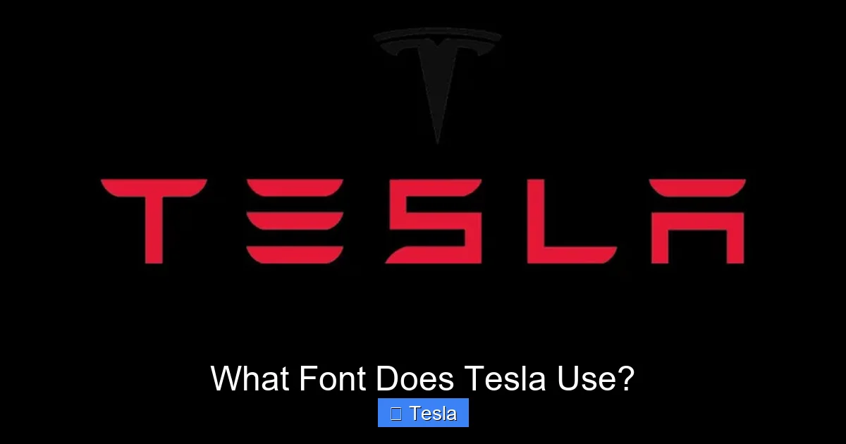
Visual guide about What Font Does Tesla Use?
Image source: fontshut.com
Key Visual Features
- Single-story ‘a’ and ‘g’: The lowercase ‘a’ and ‘g’ are the simple, round “single-story” versions (like in Futura), not the more complex “double-story” versions (like in Times New Roman). This adds to the clean, uncluttered feel.
- Squared-off terminals: Many strokes end with a clean, horizontal cut rather than a rounded or angled one. This contributes to a precise, technical, and slightly “digital” appearance.
- Uniform stroke weight: The lines are consistently thick from top to bottom, a hallmark of geometric fonts. There is little to no “contrast” (thicks and thins), which aids legibility.
- Distinctive numeral ‘1’: The numeral one often has a slight base serif and a top hook, clearly differentiating it from the uppercase ‘I’ or lowercase ‘l’.
- Wide proportions: The letters feel horizontally expansive, which helps with readability in the wide, short text blocks common in car UI.
Weight and Width Family
Tesla Sans is not a single font file; it’s a family. You will see various weights (from Thin to Bold) and possibly widths (like Condensed) used strategically:
- Thin/Light: Used for secondary information, labels, or in spacious layouts where elegance is desired.
- Regular/Medium: The workhorse. Used for most primary data: speed, state of charge, navigation street names.
- Bold/Black: Reserved for high-priority alerts, warnings, or major headings in the infotainment menus.
This systematic approach ensures a visual hierarchy. Important information is bold and large; supporting details are lighter and smaller. This is a fundamental principle of good UI design, whether for a car or a smartphone.
Beyond the Dashboard: Tesla Sans in the Entire Brand Ecosystem
The use of Tesla Sans (or a very close relative) is not confined to the car’s interior. It is the cornerstone of Tesla’s entire visual identity, creating a seamless brand experience from your phone screen to the factory wall.
- Vehicle Exterior Badging: The “TESLA” wordmark on the trunk and the “Model S/X/3/Y” badges are rendered in a custom, extended version of the typeface. It’s clean, impactful, and looks equally good in chrome or a simple black finish.
- Website and App: Navigate to Tesla.com or open the Tesla app. Every button, headline, and menu item uses the same typographic DNA as the car’s screen. This consistency reinforces brand recognition.
- Marketing & Advertising: From minimalist print ads to large-scale billboards, the font provides a unified, high-tech voice. It never feels out of place or “designed” in a flashy way; it simply is.
- Presentations and Documentation: Even in Elon Musk’s product unveilings and owner’s manuals, the typeface is present, maintaining that thread of simplicity and clarity.
This holistic application is a masterclass in brand management. Every touchpoint speaks the same visual language, making Tesla instantly recognizable. It’s a strategy focused on long-term brand equity rather than short-term trends.
Why Tesla Doesn’t Use a Standard Font (And Why It Matters)
You might ask, “Why not just use Helvetica, Arial, or even the open-source Roboto?” Many tech companies do. The answer lies in differentiation, optimization, and control.
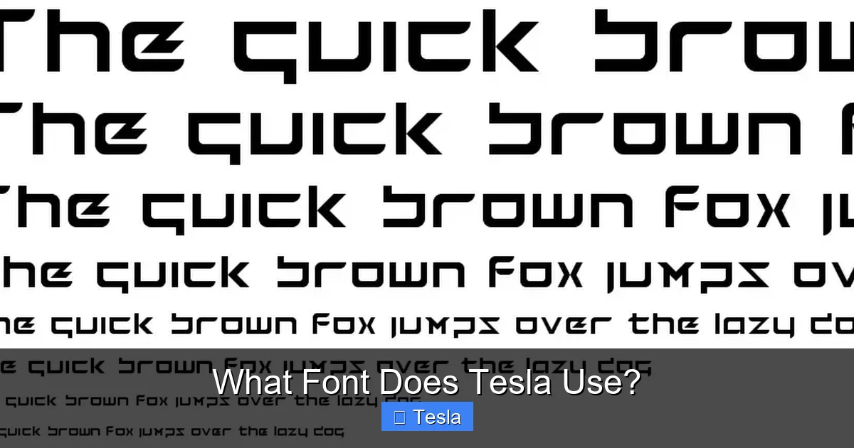
Visual guide about What Font Does Tesla Use?
Image source: fontriver.com
The Problem with Off-The-Shelf Fonts
Using a widely available font means your competitor can use the exact same one. It offers no unique signature. Furthermore, standard fonts are designed for general use—print, web, various screen resolutions. They are not optimized for the specific constraints of an automotive instrument cluster: a fixed viewing distance, a particular color scheme (often light-on-dark), and the need for maximum clarity at a glance. A font like Roboto is excellent for an Android phone but might have subtle quirks that don’t render perfectly on a 15-inch, 1920×1200 pixel automotive display running a custom Linux-based OS.
The Advantages of Going Custom
- Perfect Pixel Fit: Tesla’s engineers can ensure every glyph (character) is rasterized perfectly for their exact screen specifications, avoiding blurriness or jagged edges.
- Unique Brand Signature: Like Apple’s San Francisco font or Google’s Product Sans, Tesla Sans becomes an intangible asset. It’s a piece of intellectual property that visually separates them from the pack.
- Future-Proofing: As displays evolve (higher resolution, new aspect ratios), Tesla can update its own font file without waiting for a third-party foundry to release an update.
- Integration with Icons: The curvature of the font’s letters can be designed to harmonize with Tesla’s custom icon set, creating a more unified and pleasing aesthetic.
This commitment to bespoke solutions extends to other parts of the vehicle. For instance, the specific coolant used in a heavy-duty truck like a Dodge Ram 2500 diesel is a carefully engineered formula, not a generic off-the-shelf product. Tesla applies the same rigor to its digital components.
The Evolution Continues: What’s Next for Tesla Typography?
Design is never finished. As Tesla’s vehicle interiors change (notice the shift from a horizontal to a portrait-oriented screen in the Model 3/Y refresh) and as the Full Self-Driving (FSD) UI becomes more complex, the typography must adapt.
Adapting to New Interfaces
The upcoming “Hololens-style” FSD visualizations, which project a 3D schematic of the car’s perceived environment onto the screen, will require the font to be legible over complex, moving graphics. This may lead to subtle tweaks in weight, color (high-contrast outlines), or even the introduction of a new “display” variant of Tesla Sans optimized for overlays.
Accessibility Considerations
With a global customer base, accessibility is crucial. Future updates to the font or UI settings may include:
- Enhanced contrast modes for users with visual impairments.
- Dynamic scaling that adjusts font size based on driving speed (larger text at highway speeds).
- Dyslexia-friendly alternatives or font options within the settings menu, a feature becoming more common in modern software.
Tesla’s over-the-air update capability means these typographic refinements can be rolled out to the entire fleet seamlessly, a clear advantage over traditional automakers who design a UI for a 5-year model cycle and never touch it again.
Conclusion: More Than Just Letters
So, what font does Tesla use? The answer is Tesla Sans, a proprietary, geometric sans-serif typeface born from a need for ultimate legibility and a desire for complete brand control. It is the silent communicator in your car, the voice on your app, and the signature on the company’s billboards. It represents a core tenet of Tesla’s approach: if something is important to the user experience—whether it’s the acceleration curve, the door handle mechanism, or the shape of the letter ‘A’—you design it yourself, optimize it relentlessly, and own it completely. The next time you see that crisp, modern typeface on a Tesla, you’ll know it’s not just a font; it’s a meticulously engineered component of the product, as much a part of the “Tesla experience” as the instant torque or the silent ride.
Frequently Asked Questions
Can I download and use Tesla Sans for my own projects?
No. Tesla Sans is a proprietary, commercially restricted font owned exclusively by Tesla, Inc. It is not available for public licensing or download. Using it without permission would violate trademark and copyright laws.
Did Tesla always use its own custom font?
No. In the early years (Model S and early Model X), Tesla used a heavily modified version of the commercially available “GT America” font. The fully custom “Tesla Sans” was developed and implemented later as the company’s design and software capabilities matured, starting around the Model 3 era.
Is Tesla Sans available in any design software like Adobe Creative Cloud?
No. Since it is not a commercially licensed font, it is not included in standard font libraries like those from Adobe, Google Fonts, or Monotype. Only Tesla’s own design and engineering teams have access to the official font files.
How does Tesla ensure the font is readable for all drivers?
Tesla’s design and UX teams conduct extensive legibility testing. This includes simulating various lighting conditions (bright sun, night), viewing angles, and driving speeds. The geometric shapes, high x-height, and open counters are direct results of this human factors engineering to minimize reading time and errors.
What font is closest to Tesla Sans that I can use publicly?
The closest publicly available alternatives are geometric sans-serifs like Futura, Avenir Next, or Montserrat. However, none are exact matches. Futura is a classic inspiration but has different proportions. Montserrat is a free, open-source alternative with a similar clean, modern feel, but Tesla Sans has unique, proprietary details.
Will Tesla ever change its official font?
It’s possible. Brand identities evolve. However, any change would be gradual and carefully considered. The current font is deeply integrated into millions of vehicles and screens worldwide. A change would require a massive, coordinated update across all touchpoints. For now, Tesla Sans remains the definitive face of the brand, much like how specific tire sizes define a Nissan Altima’s performance, Tesla Sans defines its visual performance.